
Design beautiful gradients — practical guide in Xamarin.Forms with Magic Gradients
How to implement beautiful gradients in #Xamarin.Forms with #MagicGradients NuGet package.
Hi folks. A week ago Michal Malewicz post quite an informative video about the easiest way of defining beautiful gradients in Figma. Today I would like you to show the practical guide to make it in Xamarin.Forms with Magic Gradients NuGet package.
But before we begin — please check out the videos below, I will not stop on what’s shown there and just continue with additional examples about making simple beautiful gradients that are not shown there:
More about CSS Gradients in Xaml
So, let’s start where we finish on the video:

For showing better gradient I remove predefined button width and rotate phone to
Landscapemode
Now the first trick — we can remove 0% and 100% because we all-time plan to use only two colours gradients and in that case, if we don’t add values they will be predefined by the NuGet.
In the case of two colours: 0% & 100% ; In the case of three colours: 0% & 50% & 100% ; In the case of four colours: 0% & 33% & 66% & 100% ; and so on…
The next quite important thing — is that we can use HSL at CSS. For that like in the video tutorial from Michal we can simply select some HSB and convert it. For that let’s pick up any colour we want and copy his HSL value:

Now copy hsl(297, 100%, 50%) and slightly change brightness, for example to 80, this will give us hsl(297, 100%, 40%) and use that values for our CSS Gradient:

Same we can play with HEX colours as well:


No Frame or Labels — only Magic Gradients in XAML
So, what we already have — a huge piece of XAML, but do we really need that all to make UI similar to Button?
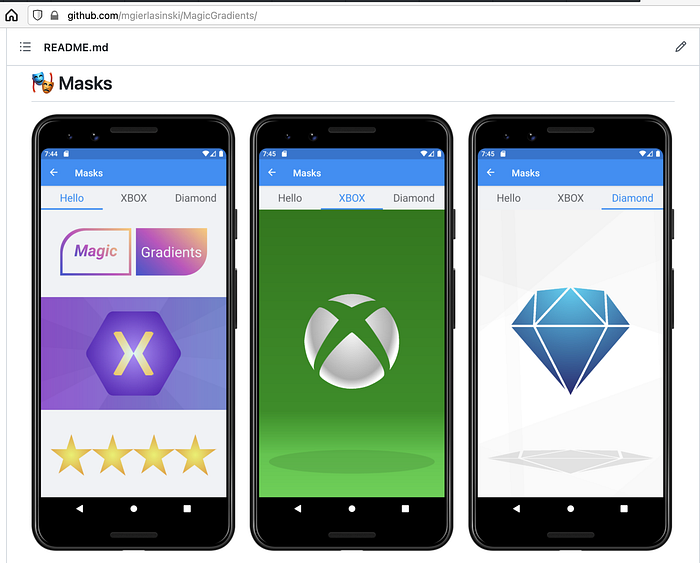
Definitely not! Why? Because we have Masks in Magic Gradients:
So… how to use that for our case???
At first — let’s replace Label with magic:TextMask . For that mask, we can set Text 😏, named or double FontSize , FontAttributes and ClipMode .
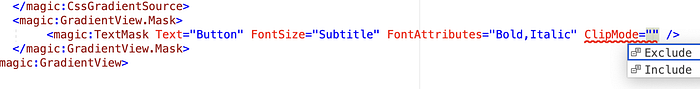
We don’t need any FontAttributes and we need to set ClipMode to Exclude . Because with Include clipping mode we will have a gradient inside text, which is not our case:

As the second step — let’s replace Frame with magic:RectangleMask . For that mask, we can set each corner individually or same value for each with Corners and set Size of the mask(for more details about Size — please check out Magic Gradients ReadMe.md file).
If you want to use more than one
Maskyou need to wrap them withinmagic:MaskCollection
After all modifications we have a simple definition of “custom” button:


Is that all. that we can do?
Nope, but defining gradients in XAML without any CSS is described in detail at Magic Gradients ReadMe.md file.
Also, in the repo, you may found an implementation of the true Magic Button as a part of the future NuGet package — MagicGradients.Toolkit.
But don’t worry I will tell you all about that when it will be released, meanwhile, you can check that out by yourself and left us with some of your comments in GitHub Issues or some Pull Request with new cool features from you 🙃 😉
https://twitter.com/bbenetskyy
https://twitter.com/MGierlasinski
https://twitter.com/michalmalewicz
